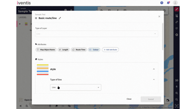
The minimum value for model and line model scaling has been extended to 0.01 (previously 0.1). This means that larger or medium-sized models will be able to scale down by up to 10x more.
Every map object is now ordered alphabetically within its layer category, instead of chronologically. As new objects are created or renamed, they will automatically be ordered accordingly.

Mobile and tablet users will now find they can navigate to their current location on a map. This feature is also available on desktop devices with location permissions enabled.
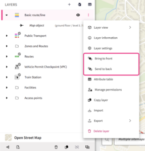
Users can now change the order in which layers are displayed in the plan. By clicking on the ‘More’ icon for a layer, users can choose to bring a layer to the front or send to back. This helps users to visualise plan layers in the most informative way for them.
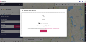
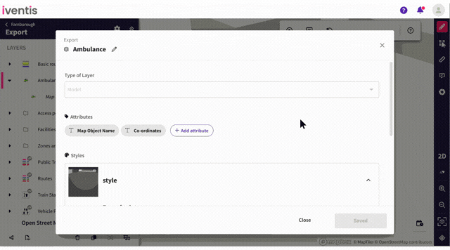
The maximum size of images uploaded to image attributes has been increased to 15MB.
When exporting a plan as a PDF, the legend can now display data-driven styling. This means that all list attributes associated with a layer will be displayed, helping users to clearly recognise and understand the object in question. The legend will show the list item name as well as the corresponding colour, model or icon related to that list item.
The maximum value for model and line model scaling has been increased to 10x. Previously capped at 3x, users can now further scale their models.
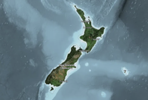
The New Zealand Satellite (LINZ) map is now available to set as a background map. This can be added to your account on request by contacting our support team.
For data-driven styling, arrows on lines can now match line colours.
When using data-driven styling for line layers, you can now set arrow colours to match the lines they accompany. Previously, arrow colours were uniform across all objects within a layer, but now you can assign colours individually to align with each line’s data-driven style.
![]()
Icons can now be oriented relative to the map, not just the view.
You can now set the rotation angle of icons and choose between 3D (raised) or 2D (flat) appearances. Icons will automatically rotate to match your point of view.
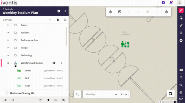
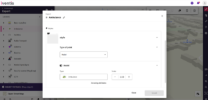
Users can now set a plan’s date and time using the date/time selector, which ensures map objects display only if they have a repeating date/time attribute that matches the selected range. Map objects without any repeating date/time attributes will be shown regardless of the selected date/time.
This functionality improves oversight of workforce shift planning. For example, if a steward is scheduled to work at a specific location on particular days or within a date range during an event, this new attribute allows users to see when stewards are on shift. This ensures clear visibility and efficient management of workforce schedules.
Improved navigation
Clicking an object from the sidebar or attribute table now pans and zooms directly to that object on the plan.
This is particularly useful for plans with multiple layers and multiple objects, where locating a specific object can be challenging. Now, users can select an object from the sidebar or attribute table and the map immediately pans to the object, making it quick and easy to find exactly what you need.
“The Iventis mapping software has been instrumental with plotting, measuring and storing the relay route on a secure platform. It allows relay planners to use the mapping software as a development tool, creating and amending the routes. Additionally, it allows for multiple user groups, with various access rights, to view or edit plans and see real-time route amendments. Plans can be shared via a link or exported in KML and PDFs files.”

“We were happy to team up with such a renowned company as Iventis which significantly supported our team in their planning and delivery. The system was used across several functional areas to develop plans and co-ordinate our efforts in the run up to the event.”